A journal

Thanks for visiting me at Experiment MOM (Mother of Multiples). My digital Scrap for Hire business, ScraPicts, is coming soon so please check back with me again or Click the Follow Me button on lefthand side of my blog.

Thursday, February 28, 2013

I love lemon (tarts!) and this week's layouts

 I just made the most delish lemon tart and I just had to share it. I pretty much followed the recipe from the Smitten Kitchen for the Whole Lemon Tart and the Great Unshrinkable Tart Shell but I made it in a pie dish  and instead of cornstarch I used flour. Oh and my lemon was HUGE and it still came out delicious.  Here is a link to the recipes and here are my foodie picts.


Tart shell before filling
before baking - notice it looks separated but it still came out smooth after baking
the finished yumminess


And here are some layouts I finished this week.  The first is of my husband's Tough Mudder that he did in early February.  He is with his teammates Keith and Brian.  It was a cold and raw day but he survived with only a few bruises and some VERY dirty socks and shoes to show for it. Oh and a particpant T-shirt. SCORE! Picts courtesy of MarathonFoto and elements by Lia Scrap Only for Boys Kit and Kelsey Inspired Studios Alpha from An Innocent Heart Collection

Lia Scrap (Only for Boys) and Kelsey Inspired Studios Alpha from An Innocent Heart Collection
The next is a picture of my cousin dressed up as an FBI agent for Halloween. I thought it would be fun to blow up the badge and hollow out the center to make it a frame.  Elements by Trixie Scraps and Melissa Bennett Designs Cops and Robbers Collab (retired) and photo courtesy of E. Foxen

 And the third is an Easter-y layout of my cousin. I used some new elements from The Urban Fairy including the Just Love, Flutter Fields, Love Me Painted Easter and photo courtesy of E. Foxen.

Friday, February 22, 2013

Layout I worked on this week...

Hey all.   I worked this layout which is a  Ribbon Board (aka French Board) for a friend's new baby.  Here is what I came up with:

The credits for this layout are: Pixels and Co: CS and RW (In Good Company Collab), Juliana Kneipp (My Sunshine), Ponytails (Love Me Do), Melissa Bennett (Cops and Robbers), Veronica Spriggs (Vintage envelopes), The Urban Fairy (Just Love), Jady Day (Greatful Hearts), AnitaDesigns and BelisaeDesigns (An Innocent Heart Collection), Libby Pritchett (A Spoon full of Sugar).

I thought this came out pretty cute but boy are there a lot of layers!  Each ribbon, its drop shadow, each button has its own layer and that is just to construct the ribbon board. It can also be tricky "slipping" pictures and elements under the ribbons because if you move one ribbon up a layer, it could create the wrong illusion for another element.  Almost everything on here has its own drop shadow which gives a more realistic feel. The other tricky part is getting the grid to look perfect.  Mine is way crooked (see how the buttons horizontally don't line up?) because I started adding stuff to it and then later tried to fix it but that was way too complicated with all the layers.  My advice to anyone who attempts this is to make the ribbon board first and make sure the ribbon grid is as perfect as you want it. Also merge down the shadow layers to the ribbons so if you do move the ribbons around, you will have the shadow along with it.

Well that's it for this week. Next week, I hope to have a new Urban Fairy kit to play with and I might even get to complete my layout for my husband's Tough Mudder that he took part in at the beginning of February.


Thursday, February 21, 2013

Home of ScraPicts

So I have finally decided on a business name: ScraPicts!  I have been toying with the idea of starting a very small scrap-for-hire business for a while now and I played around with names until I settled on something that indicates that my business is about scrapping pictures, rather than, say, scrap fabrics or scrap metal. The photo of the babies are my twin sons, Jack and Greyson at about a week old.  Our good friends Moe and Melissa Chen took this photo in our little baby photoshoot at our house the day after we brought them home. You can see they even still have their hospital bracelets on. Moe is a great landscape photograper and here is is gallery.

My Facebook banner that I will turn into business cards

I knew that to design my logo and my facebook banner, I would need some commercial use (CU) products because as a new "designer" I would not want anyone to steal my copyright so I wanted to do everything correctly. For elements, I bought several packs from  Digital Scrapbooking Studio, including this Grab Bag by Veronica Spriggs which included a couple of cool crumpled paper overlays.


And this collab kit which was actually free with a 5$ purchase but I used a bunch of the flowers and the heart locket

I also purchased this hand brushed alpha by Digilicious Designs which I love because you can recolor it to anything you need. That is what is pretty nice about a lot of the CU (commercial use) products is that they are pretty versatile. You can make them into what you need for your individual purpose and many are even rated for making other scrapping products.


In addition I have to give a huge shout-out to Kevin and Amanda at KevinandAmanda Fonts for Peas. They are font designers that will take your handwriting and make it into a font and then provide it to the scrapbooking community for free.  For commercial use, you have to agree to post one or more of their buttons on your webpage which I have done (see top right corner of my blog). In my logo, I used this cool font Pea Stitchasaurus Rex


and this one, Baby Boston,which I am IN LOVE WITH!!!
So as far as getting the business started, well, that won't actually happen for a while. I want to get some more designing under my belt and I also am planning on donating my services in a Silent Auction for the Sadlleback Mothers of Multiples group (which I am a member of) in April. I figure at that point I will start running on word of mouth so that I don't get too overwhelmed and also I have no idea if this type of service will even be something that people will pay for.  I have to start thinking about my business model and some very small advertising but I don't want to spend too much money up front to do any of that.  I also am SO grateful to the many designers out there that allow S4H (scrap for hire) with their products (that you Danielle at The Urban Fairy and MANY others!) without having to purchase any sort of separate commercial license. Unfortunately, some of my favorite designers and design houses (including almost everyone at Scrapgirls and Design House Digital) that I have used do not allow S4H or even scrapping for non-profits with their products and I have had to separate them out of my stash so I don't accidently use something I am not allowed to.  And I also won't be buying any more of their products :(  

Thanks for reading!!  

Jen


Tuesday, February 19, 2013

My first real live Product page with my Creative Team Layouts

Today is the day!  The first kit that I have submitted my "Creative Team" layouts for went live for purchase today at the Digital Scrapbooking Studio. The mini kit is called Blooming Love. I used a few older (ie from the summer) picts that I took of my good friend Sarah's twin girls, Ainsley and Noelle.  I used the SoftGlow function for the picture of Ainsley to give it that ethereal feel and I really like how the layout turned out, although I probably could have gotten a tad more creative with the stacked layers, maybe adding rounded corners or drop shadows.  For the pict of the two girls, I wanted to keep it simple so I didn't use a ton of embellishments.  I am so excited to be part of a creative team and I even feel like scrapping about my scrapping (is that a tad crazy? lol).

Ainsley


Noelle and Ainsley


Here is a pict of the product page with its link below:
You can buy it here
If you care you can also check out The Urban Fairy's blog post with link for a couple of freebies!!

What do you think?  Thanks for reading!

Jen


Wednesday, February 13, 2013

I joined the Creative Team at The Urban Fairy!!

Well my job interview fell through so I was pretty bummed the other day. Not going to get into details but I was feeling pretty down and then I remembered that a friend of mine had told me about a CT call (aka Creative Team call) for new members of The Urban Fairy layout team. I submitted my email to Danielle S and lo and behold she accepted me onto the team. So now I will be designing layouts using all of the fabulous TUF (The Urban Fairy) designs and elements which I am stoked about. It will be a challenge for sure because as you know I have two little down and dirty boys and TUF stuff is very butterfly/fairy/glitter oriented but I'llmake it work.  So here is my first ever TUF layout.  This is my sister Laura and her fiance Fili. They are getting married on Friday (feb 15th). Amore is an ode to Fili, in that he is Italian.  Ormai la frittata è fatta. Auguroni!

This layout was created with the Just Love kit found here at The Digital Scrapbooking Studio store.  I especially like the embossed labels in this kit (sucker for labels!)


Monday, February 11, 2013

Some different styles of Digital Scrapbooking

So as I engage more with the international digital scrapbooking community I am being introduced to different styles of digital scrapbooking.  One style is more fantasy-based, where your subject is inserted into the fantasy world as if they are a character in it.  My friend from India introduced me to this style and I tried my hand at it in this layout where Greyson is the "Frog Prince."

Here is the original photo of Greyson. In GIMP I created a new layer with Transparency as the background and then opened the picture with the Open as Layer option.  I used the Free select tool to cut him out of the picture and then I used the eraser at 50% opacity to smooth edges.  When I was happy with the extraction I exported the picture as a png to preserves the transparent background.


I used a freebie paper by Avital Scrap called Fairy Lake and some elements from JulieC Designs Feeling Blue collection to create the fantasy layout below.

I have also been looking at the Project Life style of scrapping. Now I don't journal like a lot of people do, but this is supposed to be great for journaling and for hybrid (part digital, part physical) scrapping.  Basically there are set "pockets" for pictures and other cards.  The pockets can be physical and then you can use a ring binder to contain them or they can be digital and just have the look of being a ring-binder page with pockets.  Usually there are setups with 4x6 and 3x5 cards in various configurations.  I took a quick stab at it with a couple of my own layouts without pockets:
Paper and Elements by Misty Cato (JoyfulNoise)


Shawna Clingerman (You are my Happy), JulieC Designs (Feeling Blue)
Text: DJB Milkmaid
and my Single Photo Explosion with pockets:
Traci Reed DocumentLife Slip-in
Mari Koegelenberg at Mydigitalartstudio

That last layout was pretty simple. I just used the DocumentLife Slipin Mat template and just imported my photo and used the technique I documented in my post about using PSD templates to cut the segments.  It was a snap!  There are lots of resources for doing this style of scrapping.  You can google Project Life, DocumentLife, or even Pocket Life from Scrapgirls There is a great set of blogs posts on Digi.Shop.Talk about Project Life.

 - Jen


Thursday, February 7, 2013

Just For Fun - Recent Scrapbooking Pages

Credits for Eat Your Veggies:
Paper: Word Art World (Those Who Love)
Alpha:  World Art World Alpha FB Jan2013 Freebie
Embellishments: Studio basic Designs (Only You! News Freebie, Fly Away with Me), Angela Blanchard (Water’s Edge), Growing Pains Scrapped (Down on the Farm), DigiDesignResort (Natural Breeze Collaboration)


Credits for Pan Band
Papers: Julie White (Magic Vacation), Misty Cato (Joyful Noise), Mommish (JustMe),
Embellishments: Misty Cato (Joyful Noise), Growing Pains Scrapped (Down on the Farm), Laura Louie (Boy Joy), Sarah Batford (Love Bugs)
Alpha: Gina Cabrera (Digitally Smitten Shadowed)


Credits for Down By The Bay:
Papers: Syndee Nuckles (A Whale of a Time), Angela Blanchard (WatersEdge), Laura Louie (BoyJoy)
Embellishments: Growing Pains Scrapped (Down on the Farm), Angela Blanchard (Great Outdoors), ScrapGirls (Relax),  Angela Blanchard (Naturalist’s Journal), Angela Blanchard (CuteCritters), Zoe Pearn (SoSweet), Angela Blanchard (Water’s Edge), Gina Cabrera (Oh Happy Day), Syndee Nuckles (A Whale of a Time)
Font  - Darcy Baldwin (DJB Celebrate Life)
Alpha  - JenC Designs (It’s Christmastime) 

Monday, February 4, 2013

I won a Design House Digital 4Play Digi-Challenge

Since I have started digiscrapping I have been all over the blogs and forums and recently came upon Design House Digital.  They have several weekly and monthly challenges that you can participate in, which is neat because you have the chance to win a 5$ gift certificate to their store.  Basically, the designer for that week picks 4 kits and then you have to design a layout with ONLY those elements.   I saw the January 28th 4Play Digi-Challenge kits hosted by Mary Cimeni (you have to buy them for 1$ each, so you are out 3$ to get the kits; you get the 4th kit free) and I was really inspired by Mary Moseley's WordArt from the Reminisce Collection.


My grandparents, Fred and Hazel Sigel used to label everything in their house with those embossed tape labels.  I especially remember the jars are raspberry jam that my grandmother would make.  I had this picture of them from their wedding day that I decided to scrap for this challenge.


One technique that I used on this layout was to embellish the corner flowers with snipits of other flowers to make them look more vibrant. I did this by pulling the flower to the top layer over where I wanted it to peek out and then used the Free Select tool to trace around the flower section that will peek out. I then copied and pasted that to a new layer, hid the full flower, and then positioned the flower petal peek layer where I wanted it.  


Paper before adding elements
The journaling on this layout reads:
My grandfather and grandmother were married in 1938 and were together for 65 years.  I remember that my grandfather Fred loved to use the embossing tape label maker to label things around their house like bottles of homemade raspberry jam and the buttons on the intercom that was connected to the garage and my great Aunt Pat's house, which was just next door.  In January, we remember the passing of both my Grandmother Hazel, in 2003, and my Grandfather Fred almost exactly one year later, in 2004.

So I won a 5$ gift certificate to the DHD store.  Weehoo!!  Thanks so much, DHD!!!


Sunday, February 3, 2013

DigiScrapping Tutorial: How to use PSD template in GIMP

I was recently asked by a blog commenter (and fellow digiscrapping addict Priya) if I knew how to use templates in GIMP. I had to admit that I hadn't used any templates in my limited time at digiscrapping so off to the web I went. I knew that I had downloaded a few photoshop templates (with the file extension PSD) but just assumed that I wouldn't be able to use them in the GIMP program.  I also felt that using templates (where the boxes for your picture and some embellishments etc are alread laid out for you) is a tad bit cheating at digiscrapping but I guess it is a good place for new scrappers to start.  So anyways here is what I found out.  I found this tutorial by Sommerfug Design and followed it pretty much as described though I have a few clarifications I'd like to add.  So here is my version of using PSD templates in GIMP. Thanks, Priya, for the post idea!!!

1. Open GIMP
2. File - New Image - Size 12inx12in or whatever size you want.
3. File  - Open as Layers – find file with your PSD template file on your computer. Click open.  All the layers of the template will load.

4. Now add a picture. File - Open as Layers - browse for the picture on your computer and click Open
5. Now, Using the Move tool (4 arrows) move the picture over the photo box where you want the picture to be (here shown in multi colors, sometimes they are grey or black). If you need to resize the image you can do that now with the Scale tool or if you want to just crop it, you can just plunk it over the photo box.
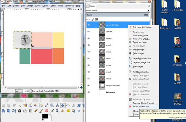
6. Here come the tricky parts.  Make sure the layer with your image is grey (ie selected).  Right click on the layer and way down at the bottom you will see Alpha to Selection. Click that.

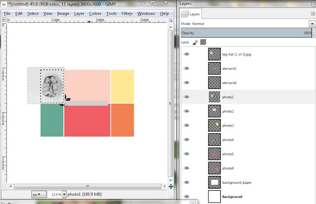
7. Now click on the layer that has the photobox that you want your picture to be in. For my example it is the light aqua box. Click on Select by Color and then click in the picture where that aqua box is (under the photo).  Click Select then Invert. Here you will see both the picture and the box (underneath) will have the "marching ants" around them.
8. Click on your photo layer and click the Delete key. This should crop your picture in the size of the box underneath.
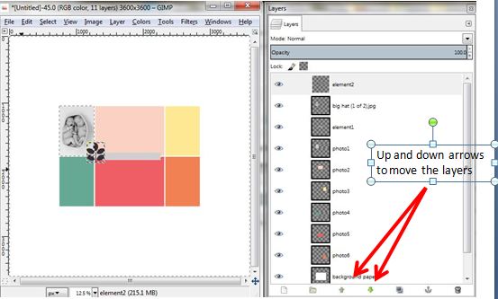
9. Now you can move your picture layer so that is floats under any embellishments on the template. You can do this in the Layers dialog box using the up and down arrows at the very bottom.

I hope this works for you. Please let me know!!

Oh and here are some newer LO's I have put together:

Credits for CAKE:
Papers: Gina Cabrera (Hello Cupcake, Confetti, Yellow Dots, Tangerine), Julie White (Snow Friends)
Word Art: Gina Cabrera (Oh Happy Day)
Alpha: MadGeniusDesigns (An Innocent Heart )
Embellishments: Juliana Kneipp (You are my Sunshine), Krystal Hartley (Just a number), Jen Dipzinski, Gina Cabrera (Oh Happy Day)


Credits for Daddy Loves You:
Papers: Traci Reed (FlyAwayWith me), SugarPlum Paperie (Grateful Hearts), Snickerdoodle (5000FBLikes)
Embellishments: Birdee’s Nest, Agnes Biro, Manue Designs, Odd, Peeps and Milo, Erika Zane, Charlize Creations, Che Yang, Mandy King,
Alpha: Zoe Pearn (So Sweet)

Credits for Take Me Out to the Ballgame:
Heather Roselli Designs Runs Batted In Collection, Erika Zane Grow, Sara Schmutz Indian Summer


linkwithin

Related Posts Plugin for WordPress, Blogger...